
Responsive web design is worth every business owner’s attention. Today, over 50% of the entire internet traffic comes from mobile devices. The internet has recorded immense activity, and that is evident in over 2 billion domains registered and over 8.8 billion mobile users globally.
For your business to be visible to the right audience, you need a responsive and mobile-friendly website crafted for best mobile experience.
Times when people use desktop computers only to visit websites is long gone! While many still surf the web on desktops, the number of users on mobile devices surpasses any other devices out there altogether, Hence, mobile-friendliness should be a core and fundamental feature expected of any small business website to maintain relevance.
However, to help you build a website that attracts traffic, leads and generate sales, let’s unravel what the term “responsive website” really means, as well as what it feels and looks like.
Oftentimes, responsive web design is confused with mobile-friendly web design, but they are not entirely the same!
What Is Responsive Web Design (RWD)?
In simple terms, responsive web design entails crafting websites through modern development approaches with the objective of making the website responsive across devices with different screen sizes. This will help the user experience of web visitors, no matter the device they are using to access the web.
Responsive website by far provides smooth usability for users across levels compared to websites that are not built to be responsive. The ability to adjust to multiple devices and not just mobile and desktop alone is a huge advantage.
Making a website mobile-friendly is not all there is to building a responsive website. While mobile-friendliness is a part of responsive web design, RWD is about crafting the web to be super flexible and work well across devices of different screen sizes and resolution. This is also one of the factors that search engines like Google use to determine websites that are rankable.
A high-quality website attracts internet visitors and builds up interest in reading through your website content. To achieve these, the website’s layout is structured using a combination of HTML, CSS styling and fundamental font styling concepts.
Importance Of A Responsive Website
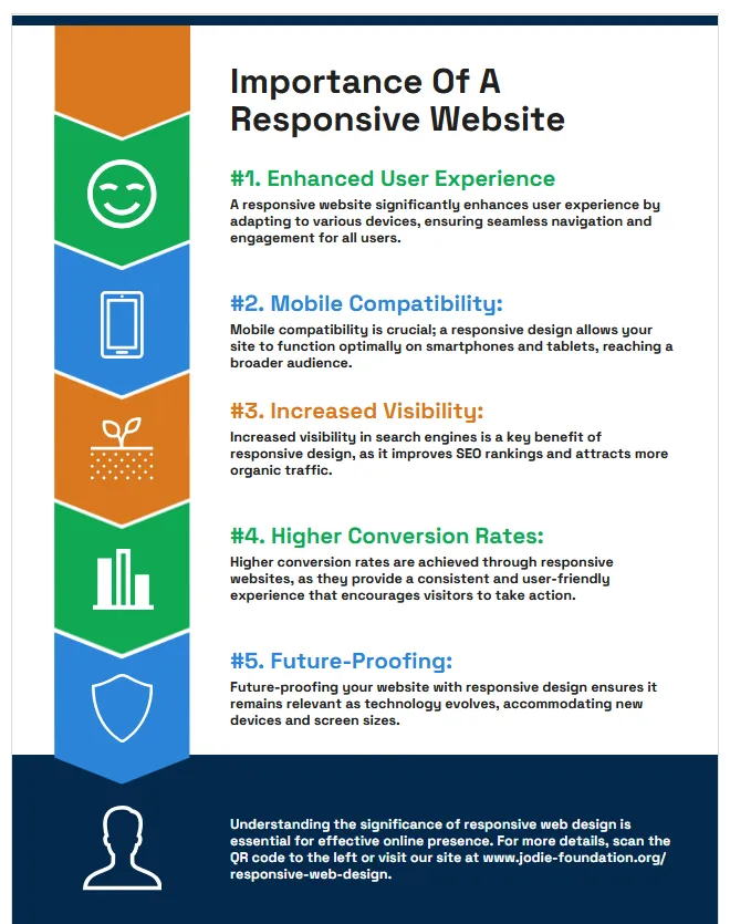
Easy Navigation: Having a responsive website enables easy navigation on all devices. It also makes website content readable on tablet, desktop and mobile devices.
Improved SEO: Since 2015, Google has enhanced responsive website performance by helping you rank on search results. In order to generate more traffic from search engines like Google, choose a responsive website.
Speed: A responsive website responds quicker to commands and boosts the loading time. A website with a fast load time will keep internet visitors engaged rather than sending them off.
Adaptability: A responsive website can adapt to future changes in the internet space and also save website users from creating different forms of websites. It is glitch-free and can adapt to any size of screen the web is being viewed on.
In essence, a responsive website eliminates the long-standing industry practice of having separate PC and mobile versions of a website.
How To Create A Responsive Website
Integrate Fluid Grid Layout: A fluid grid layout is what enables websites to fit into every screen size. This layout enables the web design to sync with every device that it is being displayed on. This layout usually appears in columns with adjustable height and width that fits into every screen size.
You can integrate the fluid grid layout into your web design by modifying the website source code.
Touch-Friendly: There was a time when people used the mouse or keyboard to navigate between menu options on a website. These days, people now browse the internet with smart devices (iPads, laptops, phones) that have touch screens. It becomes essential to put touch screen users into consideration when building a website.
In addition, keep in mind that internet users may have a hard time pressing some buttons, or clicking specific links, and it’s important to make images, and links, appear bold on both mini and large screens. So consider the below details:
- The recommended touch size is 44 × 44 pixels
- Adding spaces in between content makes your website touch-friendly.
- Avoid pop-up ads, rather integrate call-to-action links such as start saving, learn more, watch this, etc.
Optimize Website Speed: A website loading time determines whether an internet visitor stays on your website or goes away to try another website. Internet users who face a slow-loading website today will most likely turn away or try an alternative website, and that’s a huge disservice to your business.
In a situation where the bounce rate on your website is high, website traffic will reduce.
First, make sure to partner with the right web hosting provider that offers ultra-performing server resource enough to power your business site. Ensure your website speed is optimized on desktop and mobile devices by compressing images. Large-size images are one of the leading causes of a slow-loading website.
There are software and online tools such as compressor.io, image compressor and more that can be used to minimize your images.
Optimize Website Appearance: Your website appearance is a contributing factor in enhancing internet user’s experience. Ensure your texts appear bold enough and fit the screen without the need for minimizing or zooming the screen.
You can also give your website a professional look by allowing headings to appear in large font sizes, add spaces in between your website contents. You can also improve reader’s focus by integrating colour blends, bullet points, into your web design. Make sure to:
- Choose attractive Website layouts
- Make buttons bold enough to click on.
- Use visual indicators to highlight links or menu options in between contents.
- Readable content should be presented at the top with call-to-action links in between or at the bottom of the content.
Use Existing Website Theme
Website themes help save time when designing a website. You can make your website look more appealing and responsive with existing themes. Uploading a website theme does not require that you know how to code a website.
Most CMSs like WordPress, Joomla, Wix, Framer, Webflow, Shopify are classified as low code platforms where you can build websites using pre-built elements such as themes and plugins.
For WordPress web developers, there are tons of WP themes across industries that you can instantly deploy then customize to suit your web design needs.
Test Website
Building a responsive website is incomplete without testing the website. Test the speed, appearance, size, and more on all types of devices. You need to understand how your website performs on desktop and mobile devices.
This will help you to either add or remove some features to your website. Website owners should carry out routine tests on their website at least every three months for clarity on their website performance.
Seek Professional Help
If you are intentional about building a responsive website, then you must not overlook seeking professional help. You are most likely to face challenges in the course of your design if you decide to do it yourself without much technical knowledge about how web designing works.
Whether you are building entirely from scratch or redesigning a current website to be responsive, you’d save yourself a lot of cost by engaging an experienced web developer, one who has in-depth knowledge of structuring a market-ready website.
Building a Responsive Website without Coding
Most web hosting providers today now offer low code web builders that allow their clients to create responsive web design in the most effortless ways. These web builders often time onboards automatically responsive elements such as pre-built layouts and sections due to the indispensable nature of responsive web designs.
The emergence of low code platforms is bringing a transformative means to RWD approaches as well as democratising the entire web creation process, making it possible for both non-developers and developers to build an effective website with adaptable interfaces.
All you have to do is drag, and arrange several elements while building your website. Meanwhile, the AI website builder can also do all the work with the right command prompt. In addition, there are ready-to-use templates available by hosting service providers, it all depends on the route you choose and your level of experience handling this type of solution.
Frequently Asked Questions
What is responsive web design?
Building a website so it automatically adapts and looks great on any screen size, from phones to tablets to desktops.
Is responsive design the same as mobile-friendly?
Not quite. Mobile-friendly is part of it, but responsive design means the site flexes smoothly across all screen sizes and resolutions, not just mobile.
Why is responsive web design important in Nigeria?
Over half of traffic is on mobile. A responsive site keeps those visitors engaged, improves SEO, and removes the need for separate mobile and desktop sites.
Does responsive design affect SEO?
Yes. Google favours mobile-friendly, responsive sites in rankings, and faster, smoother pages keep visitors from bouncing.
Can I build a responsive website without coding?
Yes. Low-code builders and WordPress themes include responsive layouts, so non-developers can build adaptable sites, though a professional ensures the best result.
Final Thoughts
A responsive website is a must-have for every small business owner, consider the stratospheric rise in the number of mobile device users as well as the introduction of different types of devices with dynamic screen sizes and resolution.

We remain your trusted and reliable digital marketing partner at Web Design Nigeria if you have some budget to spare for a professional outcome. We will deliver growth-focused websites, crafted to help our clients reach a larger yet laser-targeted audience, improve web users’ experience, and get more paying customers to their business.
With us, you don’t have to worry about things like fluid layout, website speed optimization, server speed, silo, SEO, theme selection, enhancing website appearance, customization and more. We got you all covered!
Call us today on 08114900422 or send us your project brief using our contact page.
Need a website that actually grows your business?
Web Design Nigeria builds fast, SEO-ready websites for Nigerian businesses. Let’s talk about yours.